User guide
Editing on a phone
Outcome: you can make a real change to a design, or build one from scratch, on a phone.
The editor works at phone width with touch. Nothing on a phone needs dragging: everything is a tap.
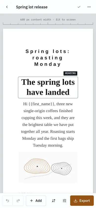
The screen
- Top bar: back to your designs, the design name, the save state, and ⋯ for more actions, including Checks and size and Import JSON….
- Canvas: the email, scaled to fit the screen.
- Action bar at the bottom: Undo, Redo, Add, Arrange, the inspector, and Export, which is always on screen.
Change a block
Tap a block to select it. The inspector rises from the bottom at Peek height with the four settings you are most likely to change for that block.
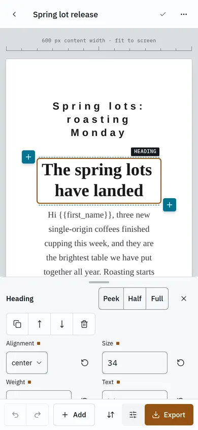
Tap Half or Full, or drag the handle, for every setting. The canvas stays visible above the inspector so you can see the effect. Close it with ✕.
Add a block
- Tap the block you want the new one next to.
- Tap Add in the action bar (or a blue + beside the block).
- Choose Above or Below, then tap an element.
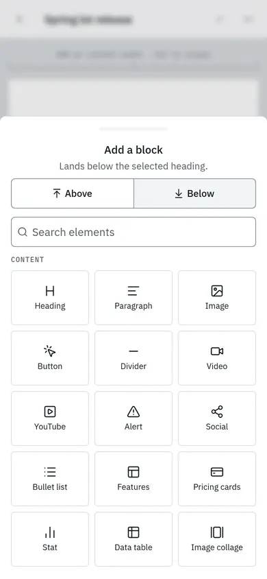
Presets and templates work the same way. A new design shows a + on its empty canvas.
Edit text
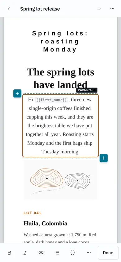
Tap a heading or paragraph, then tap its text. The keyboard opens and a formatting bar sits just above it: Bold, Italic, Link, List, merge tags { }, ⋯ for more, and Done.
Rearrange
Tap Arrange (the arrows in the action bar). The email becomes a list of rows and blocks, each with Move up and Move down. Tap Done to return with the moved block selected.
Offline
If the connection drops, the top bar says so and your changes are kept on the phone. They are saved as soon as you are back online.
What needs a larger screen
Cropping an image and building multi-column layouts from scratch need a tablet or desktop. The editor says so where it applies. At tablet width (834px and up) you get the desktop layout with touch support.