User guide
The editor
Outcome: you can find your way around the editor and make your first change to a design.
This part of the guide is for your customers, and for you when you test the product. Share these pages with them.
Open a design
Sign in at https://your-domain/login. The Designs library opens. Click any design to open it in the editor, or click New design to start an empty one.
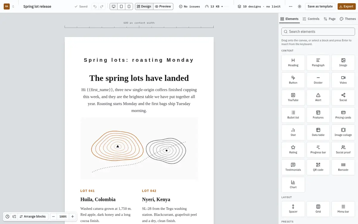
The three areas
The toolbar across the top has, from left to right:
- the design's name; click it to rename the design
- the save state (Saved, Saving…, or what went wrong), and Undo and Redo
- the preview width: Desktop, Tablet or Mobile
- Design and Preview: Preview shows the exact email your export will contain
- the email checks count and the size meter (see Email checks and the size meter)
- your plan usage
- ⋯ More actions, Save as template, and Export
The canvas in the middle is your email, on a sheet the width of the finished email (600 px unless you change it). The controls in its bottom-left corner open History, the Outline, Arrange blocks, and change the zoom.
The inspector on the right has four tabs:
| Tab | What it is for |
|---|---|
| Elements | Every block you can add, plus the ready-made layouts. |
| Controls | The settings of the selected block: content, typography, colours, spacing and visibility. |
| Page | Settings for the whole email: width, background, preview text. |
| Themes | The design's theme and brand colours. See Brand kit and themes. |
Select and change a block
Click a block on the canvas to select it. It gets an outline, a strip of actions above it (select parent, duplicate, move up, move down, delete), and the Controls tab shows its settings.
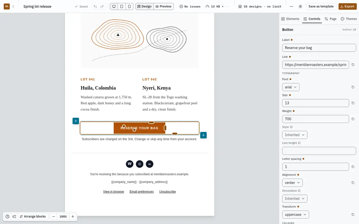
A small square next to a setting marks one you have changed from the theme; its reset arrow puts it back.
Resize, space and align on the canvas
You can change a block's size and spacing by dragging it, without typing numbers. Everything here changes the same settings the Controls tab shows, so the two stay in step, and what you see on the canvas is what the preview and the export contain.
- Images. Drag the handle on the edge to set the width. The proportions are kept; hold Shift to set width and height freely.
- Buttons. Drag the edge handle to set the width. It snaps to Fit text and to Full width.
- Spacers and dividers. Drag the bottom handle to set a spacer's height or a divider's thickness.
- Columns. Select a row (click a block, then Row in the path above it) and drag the handle between two columns to give one more room.
- Spacing. A selected block shows its padding and margin as bands at the top and bottom. Drag the round handle for padding and the flat one for margin; values move in 4 px steps.
- Alignment. The strip above a selected block has left, centre and right buttons.
Widths snap to the width of the column and to a quarter, a third, a half, two thirds and three quarters of it, and a label shows the value while you drag, such as 320 px or 50%. Hold Alt to turn snapping off. Press Esc during a drag to cancel it.
Each handle is also reachable with Tab. Press the arrow keys to change the value by 1 px, or hold Shift for 10 px; between columns, each press moves one twelfth of the row. Every drag or run of key presses is one undo step. While the canvas is set to Mobile, a resize or spacing change is saved for phones only and leaves the desktop layout as it was.
Positioning a block at any point on the page is not offered: email programs such as Outlook and Gmail ignore it, so a design built that way would not arrive as you made it.
Preview the real email
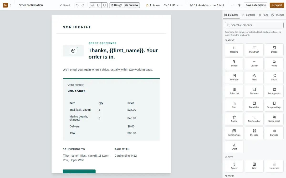
Click Preview in the toolbar to see the exact HTML your export will contain, at the width chosen next to it. Switch Mobile to see how columns stack on a phone. Click Design to go back to editing.
Add a block
- Drag an element from the Elements tab onto the canvas. A line shows where it will land.
- Or select a block and press Enter, then choose an element. It is added below the selection.
- Or click one of the + buttons that appear above and below the selected block.
See Blocks and presets for what each block does.
Saving and history
There is no save button. Every change is saved a moment after you make it, and the toolbar says Saved when it is done. If the connection drops, your changes are kept in the browser and saved when you are back online.
Undo (Ctrl/⌘+Z) and Redo work across every change. History lists each step; click one to go back to it.
If you and a colleague change the same design at the same time, the editor shows both versions side by side and lets you choose, field by field. Nothing is lost silently.
Using only the keyboard
Everything in the editor works without a mouse. Tab moves between the toolbar, canvas and inspector, Enter on a selected block inserts a new one, and Alt+↑ / Alt+↓ move the selected block in the Outline.